Banchini - Parma 1879
Art Direction, Brand Identity & Packaging
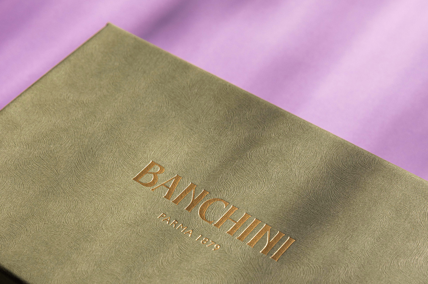
We reinterpreted the visual identity of Banchini, the oldest chocolate shop in Parma, by highlighting its history and tradition with a contemporary twist. Drawing inspiration from the aesthetic of Belle Époque and the sinuousness of the shapes of Art Nouveau, we designed a new logo evoking the visual languages spread in Europe during the early activity of the chocolate factory (founded in 1879). Fresh, elegant and iconic, the logo is the outcome of an elaboration of graphic elements adopted by Banchini company at the beginning of 1900. Furthermore, as a tribute to the founder, we created a trademark that graphically merges the type of the new logo with the calligraphic trace of Gian Battista Banchini’s signature, in order to shed light on the company’s emphasis on the deeply interwoven relationship between tradition and innovation.


We also designed the new packaging for the line of chocolate bars prepared according to the Principe original recipe, and the Principino snacks. The design, based on refined shapes, sophisticated chromatic nuances and recurrent graphic elements – such as frames and geometric patterns – recalls a vintage aesthetic. Enriched by printing techniques such as debossing and gold foil, the paper chosen for the packaging has a peculiar texture made of organic and undulating lines typical of Art Nouveau.


Thanks for watching!
follow us on instagram @drogheria_studio


